Website Design Research – What makes an effective website?
All of the factors below create an effective website:
- Proportion
- Scale
- Use of image/photography/illustration
- Use of colour
- Use of branding
- Language (target audience)
- Navigation and direction of information
- Typography (presentation of information)
- USP’s (unique selling points)
- Mobile and tablet friendly design
Website Research
Nike
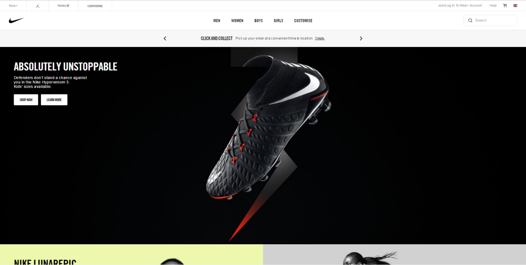
The proportion balance between the images and text is big, the images are bigger than the text, so the images are the first features the audience see. The text is not the main focus of the home page for the website. It’s the added detail but it’s the imagery they want the audience to focus on.
The size of the images is big, they want to catch the audience’s eyes on their latest products by putting big images on the home page of them. The images take up the whole width of the page and leave no gaps. The size of the text is good, might be a bit small but it is still readable to the viewers.
The use of imagery for Nike is effective because they feature their newest product in big and as the most eye-catching aspect on the page. The image takes up the whole width of the page leaving no gaps (image strip), below the first image they have 2 or 3 more image strips possibly a video strip. The width of the page is all taken and there are no gaps between the strips either. They wanted every aspect of the homepage to be covered.
The use of colour on their home page is mainly by the picture that they have inserted, the navigation bar is white, so the images give the colour of the page. This also makes the images engaging and eye catching to the audience.
Branding is used on their website by advertising their newest products, their products have their logos, so the images/videos show the logo on the products.
The language on the website is simple and understandable to the audience. The language that Nike uses is suitable from the ages of 6+, this is because they get a range of all ages that use their website. Therefore the language that they use isn’t as complex or professional.
The navigation they use is effective and simple, they have 5 options plus a search bar, you just hover over one of the sections and then a drop box of all the areas comes down to a more refined search. You can also check out their newest products they are adverting on the home page by clicking on the links used as an overlay on top of the pictures/videos.
The presentation of their information isn’t complex, it is clear and simple, you are able see all the information on the page. In addition to this the links on top of the images and videos are in the top left corner in a colour that will make it be seen easily.
The unique selling points of Nike are the swoosh (logo) and their wide use of colour to advertise their products. These areas are important because their logo is widely recognisable on an international scale along, you will see the logo on a product and know that it is Nike. Their use of colour is linked to their USP because their products can range in different colours, and to advertise them they can be bright and eye-catching towards the audience. The colours will also link to a particular age group, so it is effective.
Nike is mobile friendly:


McLaren
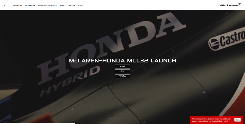
The proportion balance between the text and imagery isn’t too bad. This is because the text is big and the videos/pictures on the home page take up the whole screen. The navigation bar text is smaller but still readable towards the audience.
The size of the images/videos is big, they want to catch the audience’s eyes on their latest updates/events by making the images/videos take up the whole screen on the home page. The size of the text is big enough for the audience to read it, there also links over the top of the images/videos to their separate websites for the viewers to navigate to them easily.
The use of imagery/videos for McLaren is effective because they feature their latest updates on a large scale and as the most eye-catching aspect on the page. The whole page is taken up with the images/videos because they want no empty space left. The images/videos are on a slideshow which is effective because it is therefore not a static website that looks boring.
The use of colour on their home page is mainly by the slideshow that they have as their main feature, the navigation bar is a white to grey gradient, so the slideshow gives the colour of the page. This also makes the images/videos engaging and eye catching to the audience.
Branding is used on their website by having their logo in the top right of the page. The branding is also used when they show off their other websites (navigation) where there is a shop, their formula 1 racing, latest cars, etc. This all represents the branding of the company.
The language on the website is more professional compared to Nike. The language that McLaren uses is suitable for the ages of 12+, this is because they have an older audience that would use their website. The language that the use is more suitable for their company and therefore works effectively.
The navigation they use is effective and simple, they have 6 options, you just hover over one of the sections and then a drop box of all the areas comes down to a more refined search. The drop box is all animated for more of a professional look to their website.
The presentation of their information isn’t complex, it is clear and simple, you are able see all the information on the page. In addition to this the links on top of the images/videos are in the centre and very clear to the audience.
The unique selling points of McLaren are their cars (supercars and formula 1 cars). Their logo has now been incorporated into the design for their cars in their front headlights. This is a clever way to use the logo, and I feel as though it works effectively, this then can help to represent the brand because of the audience are able to recognise the logo easier.
McLaren is a mobile friendly site, the videos that would play on a computer are now images for a mobile, this is so the website doesn’t lag for phones.


Waterstones
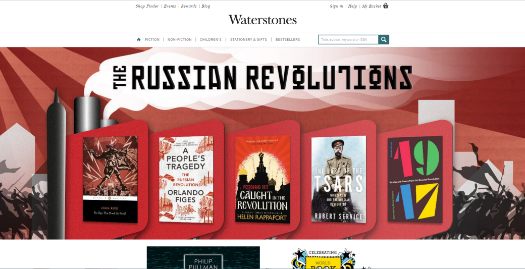
The proportion balance between the text and imagery is different from the McLaren and Nike Website because the text is much bigger and is also advertising their new books. Therefore the balance between the wide image taking up the whole width and the big sub-heading is fairly balanced. The navigation bar text is smaller but still readable towards the audience.
The size of the images is big, they want to catch the audience’s eyes on their newest books they have to offer by making the images take up a lot of the space they have to offer. The books and their titles are clear and understandable from the main image they have featured large on their website.
The use of imagery for Waterstones is effective because they advertise their newest offers/deals, books and more on a large scale, this is then the most eye-catching aspect on the page. The top of the page is taken up by a large scale image of books they have, the rest of the page has different areas of the books in which the viewers can browse.
The use of colour on their home page is represented by the book covers, the web page itself is white and the books provide the colour. The website without the books would be plain white so the books are eye-catching and engage the audience. The use of larger image at the top of the page presents the colourfulness of the company and website itself.
Branding is used on their website by having their logo in the centre of the page just above the navigation bar. The branding for Waterstones is also used by the use of the colour black with the white, it is simple and easily recognisable. It then looks more professional and ‘rich’.
The language on the website is more higher class in terms of the words used and the structure of the sentences. The language that Waterstones uses is suitable for the ages of 15+, this is because they have an older audience that would use their website. The language that Waterstones has decided to use for their website is sophisticated and higher class, it represents richness which suits their company I feel.
The navigation they use is effective and simple, they have 5 options, if you hover over the first three categories then a drop box of all the areas comes down to a more refined search. The drop box is all animated for more of a professional look to their website. The navigation also includes a search bar where the audience can search for authors, book names and more.
The presentation of their information is well organised, it is clear, simple and effective. You are able see all the information on the page without any trouble. The navigation bar is clear along with their logo in big just above. the website has been made with a grid to keep the information well organised and well presented for the viewers.
The unique selling points of Waterstones are their books. Waterstones also sell board games, stationary and more, but their main focus are their books. Waterstones doesn’t really have a logo, but their typography is recognisable for people who go into Waterstones a lot or have heard of the brand. It’s simple and effective typography for their logo.
Waterstones is a mobile friendly site:


Sports Direct
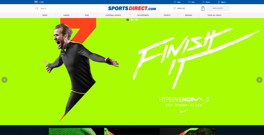
The proportion balance between the text and imagery is well balanced, the images are big, but the text isn’t too small. The images can be well seen and the text is big enough to read for all audiences.
The size of the images is so big, they want to catch the audience’s eyes on their newest products, the products that are advertised are generally bright and bold, they catch the eyes of the audience.
The use of imagery for Sports Direct is effective because the images that they use is to showcase new sports gear, the images are so big they take up the whole page, width and height. It is eye catching and engaging because the products that they advertise you bright, bold colours so the images stand out.
The use of colour on their home page is represented by the images to advertise their newest products. Colour is also used within their logo (colour scheme) with the use of red and black. The logo is simple and the colour scheme i too, the use of bright colours that can stand out from a long distance.
Branding is used with the use of their colour palette, the red and blue is now associated with Sports Direct. The company also uses their branding by having their own product as a cheaper option to products like Nike and Adidas.
The language on the website isn’t complex or high class, it has a younger audience as well as an older audience, sport is appealing to all ages. So the language is simple and easy to understand.
The navigation they use is effective and simple, it is situated at the top of the page, there are 8 options with a search. The use of drop-down menus allows for a more refined search into the area you are specifically looking for. It is easy to understand and navigate around the website.
The presentation of their information is well organised, it is clear, simple and effective. You are able see all the information on the page without any trouble. The fact that a younger audience uses their website it had to be designed to them as well as an older audience, so having a more complicated presentation of information and imagery would make it hard for the target audiences to use the website.
The unique selling points of Sports Direct are their sports gear, from football, rugby all they way to golf, hockey and more. They sell a wide range of products, the most popular area is football and possibly rugby second. So their homepage advertising will focus more on football than any other sport or activity.
Sports Direct is a mobile friendly site:


